To make landing page design work without wasting your budget, you must prioritise conversion-focused elements like a single offer, clear messaging, and fast load times over expensive, unfocused creative. A landing page is not a website homepage; it is a purpose-built tool designed to convert traffic from a specific source into a specific action. Wasted budget is the direct result of confusing these two functions.
Many business owners, burned by past agency experiences, view landing pages as a costly creative exercise with questionable returns. This happens when design precedes strategy. An effective landing page is a science, not just an art — engineered based on data about your audience, the offer’s value, and the user’s intent. According to Unbounce, the average landing page conversion rate is around 9.7%, but top performers convert at 27% or higher. The difference is not a bigger budget; it is a smarter one.
This guide provides a data-driven framework for developing landing pages that generate measurable ROI. We detail where to allocate your budget for maximum impact, what components are critical for conversion, and how to measure success. This is the approach CiCon Marketing has refined over 15+ years and 250+ projects for businesses in Richmond Hill and across the GTA.
The Anatomy of a Budget-Wasting Landing Page
A landing page fails when it creates friction. Friction is anything that makes it harder for the user to take the desired action. These pages often look impressive but perform poorly, draining your ad spend and delivering few, if any, qualified leads. Understanding these common pitfalls is the first step to avoiding them.
One of the most frequent mistakes is a cluttered page with multiple, competing offers. A landing page should have one goal. When you present a visitor with options to "Book a Demo," "Download Our Ebook," "Follow Us on Social," and "Read Our Blog," you create decision paralysis. Research on choice overload shows that reducing options can significantly increase conversions. Your landing page must have a 1:1 attention ratio — one goal, one CTA.
Slow load times are another budget killer. Google data shows that the probability of a bounce increases by 32% as page load time goes from 1 second to 3 seconds. A high-resolution video background that takes 5 seconds to load is actively working against your conversion goals. Your budget is better spent optimising image sizes and streamlining code than on heavy elements that drive users away before they see your offer.
Finally, a lack of mobile optimisation is unacceptable. With over 60% of web traffic originating from mobile devices, a landing page that is not designed mobile-first is already obsolete. This does not just mean it should work on a phone — the experience must be designed for a smaller screen and thumb-scrolling: large tap targets, legible fonts, and forms that are simple to complete on a mobile keyboard.
of web traffic originates from mobile devices — landing pages must be designed mobile-first
Google Mobile Traffic Report
The Data-First Framework for High-ROI Landing Pages
Building a landing page that converts is a systematic process. It begins long before a single pixel is designed. This framework ensures every element on the page serves the single purpose of conversion, protecting your budget from being spent on non-essential, low-impact features.
Step 1: Define the Single Conversion Goal
Before anything else, define the one action you want a user to take. Is it to fill out a form, schedule a call, purchase a product, or download a guide? This single goal dictates every subsequent decision. If the goal is to generate a lead for a dental clinic in Richmond Hill, the page will be structured differently than a page selling a software subscription. This clarity prevents distracting navigation links, social media feeds, or secondary CTAs.
Step 2: Master Message Match
Message match is the principle of aligning the content of your landing page with the content of the ad that brought the visitor there. If your Google Ad promises a "50% Discount on Tax Services," your landing page headline must echo that exact offer. A disconnect between the ad’s promise and the landing page’s message is a primary cause of high bounce rates. For campaigns on social platforms, this alignment is critical, as detailed in our work as a Meta Ads agency.
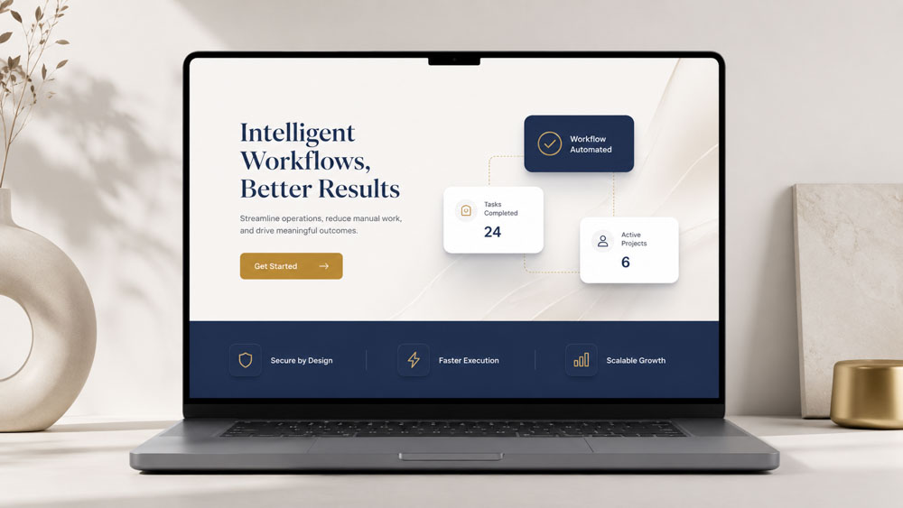
Step 3: Engineer the User Journey Above the Fold
The above-the-fold section — what is visible without scrolling — is your most valuable real estate. It must answer three questions in under five seconds: Where am I? What can I do here? Why should I do it? This is accomplished with four key elements:
- Headline: The single most important piece of copy. It must be benefit-oriented and reflect the message match from the ad.
- Sub-headline: A brief sentence that elaborates on the headline’s promise and reinforces the offer.
- Hero Shot: A high-quality image or short video showing the product or service in context. Custom media is a smart investment here — generic stock photos erode trust.
- Call-to-Action (CTA): The button for the primary conversion goal. It should be visually prominent and use action-oriented text — "Get My Free Quote" outperforms "Submit" every time.
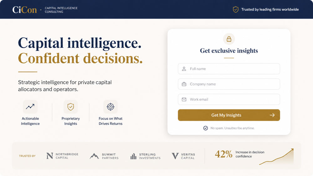
Step 4: Build Trust with Social Proof and Authority Signals
Once you have captured the user’s attention, you must build trust to earn the conversion. Incorporate client testimonials with names and photos, case studies with specific data, logos of well-known clients or partners, and industry awards or certifications. For service businesses, 5-star Google reviews displayed via Trustindex are among the most powerful trust signals available.
Step 5: Design a Frictionless Form
If your conversion goal involves a form, it must be as simple as possible. Every additional field is a point of friction that causes users to abandon. Only ask for information you absolutely need to qualify and contact the lead. Use clear labels, inline validation for real-time feedback, and ensure the form is easy to complete on mobile. For lead generation, a name and email or phone number is often sufficient for initial contact.
Budget Allocation: Where to Invest and Where to Save
A common misconception is that a higher budget automatically leads to a better landing page. The reality is that budget allocation determines success. Knowing where to invest for high ROI and where to save is critical. Spending thousands on a custom illustration is a waste if your page takes six seconds to load.
Your primary investment should be in strategy and copywriting. Strategy defines the audience, offer, and conversion goal. Copywriting translates that strategy into compelling, persuasive language that guides the user to action. These two elements have the highest impact on conversion rates — a well-written page on a simple template will always outperform a beautifully designed page with weak, unfocused messaging.
In design and development, focus on speed and usability, not complexity. Invest in a clean, mobile-first design that loads in under two seconds — optimised images, reliable hosting, and no heavy scripts or plugins. Instead of paying for complex animations, invest that budget in A/B testing tools like Hotjar to understand user behaviour and iteratively improve based on real data. Custom photography or a short explainer video builds more trust than any animation ever could.
Smart investments vs. common money pits — a practical breakdown:
- Copywriting — Smart: Data-driven, benefit-focused copy from a specialist. Money pit: vague, feature-heavy text written by a generalist.
- Design — Smart: Clean, mobile-first layout focused on usability. Money pit: complex animations and auto-playing video backgrounds.
- Development — Smart: Optimisation for Core Web Vitals (speed, LCP, CLS). Money pit: custom-coded features without a clear conversion goal.
- Tools — Smart: A/B testing, heatmaps, and analytics (Hotjar, GA4). Money pit: expensive all-in-one suites that are underutilised.
- Imagery — Smart: Professional custom photography or video showing your actual work and team. Money pit: generic stock imagery that erodes trust instantly.
The Role of Localisation for GTA Businesses
For businesses serving specific geographic areas like those in the Greater Toronto Area, generic landing pages are a missed opportunity. Localisation is a powerful tool for increasing relevance and conversion rates. A user in Vaughan searching for a service has a different context than a user in Scarborough. Acknowledging this on your landing page builds immediate rapport and signals that you understand their community.
Localisation can be as simple as dynamically inserting the user’s city name into the headline (e.g., “The Top-Rated Roofing Contractor in Markham”). It can also be more sophisticated — unique imagery, testimonials from local clients, or area-specific offers. For example, a landing page for a Meta Ads campaign targeting Richmond Hill could feature a map of the area, mention local landmarks, and showcase reviews from Richmond Hill residents.
This approach not only improves paid campaign conversions but also supports your broader SEO efforts. Creating geographically-targeted content is a core tenet of successful local SEO. As outlined in our Toronto local SEO guide, these pages can begin to rank organically for local search terms — providing a long-term asset that generates leads long after a paid campaign ends. This transforms a temporary campaign tool into a lasting piece of digital real estate.

Final Recommendation
Stop treating landing pages as a creative expense and start treating them as a scientific investment. The most common source of wasted budget is a focus on aesthetics over function. A landing page that wins design awards but fails to convert is a liability, not an asset.
For businesses in Richmond Hill and across the GTA, the most effective and budget-conscious approach is to adopt a data-first framework. Prioritise a single conversion goal, master message match from your ad source, build trust with authentic social proof, and relentlessly remove friction from the user’s path. Invest in strategy and copywriting first, and use design to support that message with speed and clarity.
Our specific recommendation is to partner with a boutique agency that integrates strategy, media production, and analytics under one roof. This avoids the communication gaps and competing priorities that inflate costs and kill ROI when working with separate design, ad, and development teams. This integrated approach is the most direct path to building landing pages that work.